Devlog 8: Player Experience
Improving the player experience
Greetings everyone! This devlog will cover our progress during the second to last week of production. Our main focus this week was to improve the overall player experience and to make sure players actually know what to do and how to play the game. We had some feedback about this earlier and we felt it was finally time to address all those issues. We aren't quite done with it, but we did make some very good progress in making the game more intuitive.
UI Overhaul
We had to rework the Unreal’s widget focus system a little by overriding some functionality for all widgets and buttons. It’s working pretty reliably at the moment, but some more work is required. And since the controller navigation works so well, the mouse input was removed for now. From the start it was meant to be a debug tool, and now we have finally moved past the stage where it would be useful to have. The keyboard is still usable and we'll likely keep it even in the end.
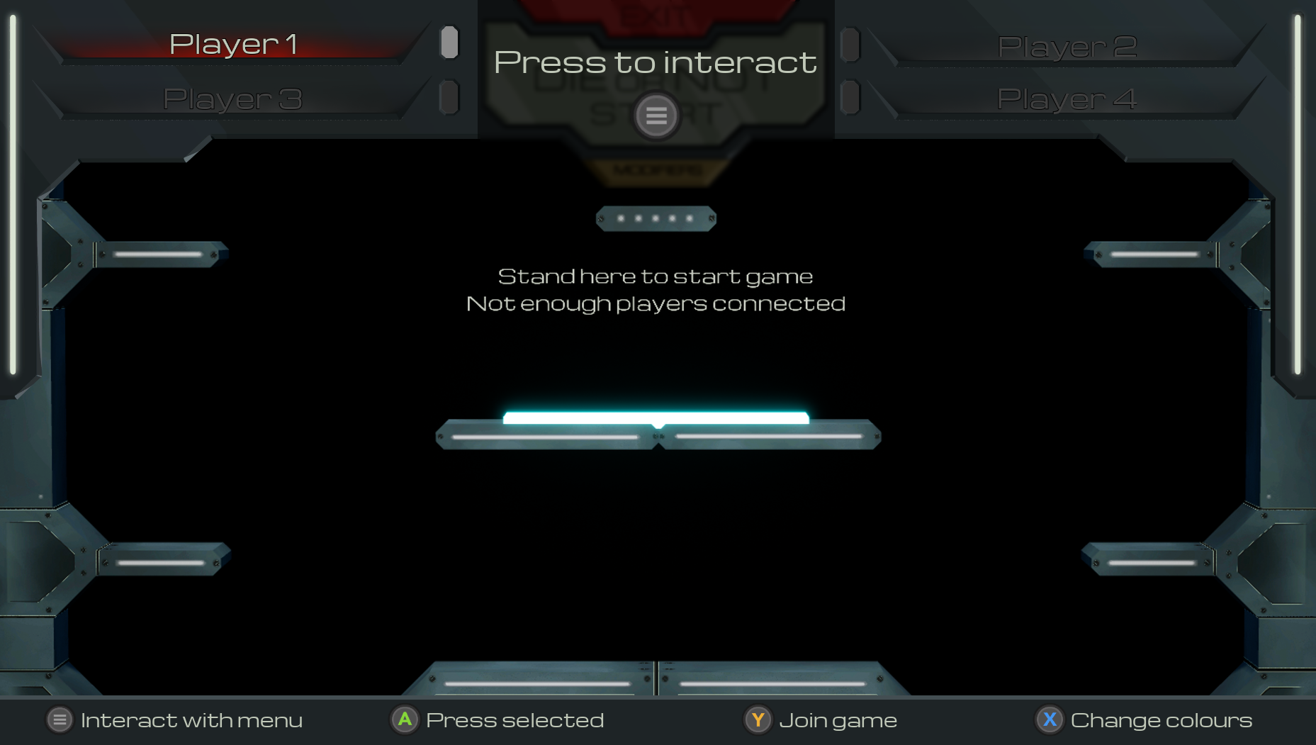
Below you can see the new main menu. The game can be started by standing on the glowing platform. Now only one player can control the menus at once, and only after pressing the option key. At the bottom of the screen you can find the usual UI controls. We felt it was necessary to add them for clarity, as the UI was a little hard to navigate.

This is the modifier menu of the game, accessible from the main menu. The game experience can be customized through some options, although the names might not mean much yet. We'll talk about some of them later in this post, and some will be highlighted next week.

Here's the new power up menu. Player scores can be seen in the corners and the current players selection is highlighted in their color. Also the tube near their score is highlighted similarly. We still have to tweak the text settings on the power-up cards, but this is already pretty final.

Finally, we are able to pause the game. If the game gets too heated just press the option key during gameplay and this menu pops up. It might be also useful to check out the controls while here.

Dynamic scores
Players now receive a hidden score based on their actions in the game which can in turn be used to balance certain aspects of the game. For example, the players with the lowest score may gain more powerful power-ups or get some other boosts. While this sounds good for those players, not everyone will be on board with the idea. To account for that, the extra power-ups are now an option in the modifiers menu, as seen in the earlier image.
New power-ups
We added many new power-ups into the game. The most noticeable ones are the balance power-ups that are only given when the option is set before the game is started. These include immunity to your own bullets and automatic parry. While these are indeed very powerful, we felt that some balancing is required for the new players to have a nice experience.
Other than the balance power-ups we have also added a couple of new active powerups, safe zone and shoot again. What these power-ups do exactly, we'll let you discover yourself.
Most active power-ups are meant to only be useable once per round, because multiple uses would give the player a way bigger advantage over the others. This is why we gave single-use power-ups a very long cooldown and we remove all cooldowns at the beginning of the next round allowing the players to use their active power-ups again.
New designs
We worked on the HUD as well in the past week, and what has been designed to be there for now is already fully implemented!

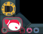
This is how all the character information will be displayed on the screen (active power-up, charged/uncharged parry, bullet/no bullet available, passive power-ups). In the HUD will be displayed the duration of the current round as well. Apart from that, we have designed and implemented all the needed icons for the power-ups!

More effects
The shooting effect is now fully implemented as well! As the others it may need a little bit of tweaking but it feels better already. In the following gif it's possible to appreciate already the implemented HUD. Following everything going on in the game can be challenging, but checking the HUD might make some sense out of the game.

Next week
For the final week of production we are going to be adding the remaining effects and some additional challenges into the level. Also it's about time we look into adding some sound effects, don't you think? Well maybe next week we'll have some good news for you then.
Stay tuned for next week's devlog as we step into the final week of production.
Files
Get Die Or Not
Die Or Not
Fast-paced and fun local PvP platformer game
| Status | Released |
| Authors | Delion Arken, monocromo13, Piotr Zaraś, Hazedos |
| Genre | Platformer, Fighting |
| Tags | Fast-Paced, Local multiplayer, party-game, PvP, Unreal Engine |
| Languages | English |
More posts
- Devlog 11: Game releaseMay 30, 2023
- Devlog 10: Polish timeMay 23, 2023
- Devlog 9: End of ProductionMay 15, 2023
- Devlog 7: Effects and moreMay 02, 2023
- Devlog 6: The halfway pointApr 25, 2023
- Devlog 5.2: Back to developmentApr 17, 2023
- Devlog 5.1: Easter is here!Apr 03, 2023
- Devlog 4: Production starts!Mar 28, 2023
- Devlog 3: Final prototypes and game designMar 20, 2023

Leave a comment
Log in with itch.io to leave a comment.